
Adding a widget used to mean building a structure first. You added a row, then a column, then dropped the widget into the space you'd made — and if you wanted it somewhere else, you rebuilt the structure.

It worked, but it was the thing people found hardest about Planify Pro. The most common piece of feedback we get is some version of "why can't I just put the widget where I want it, like in Canva?"
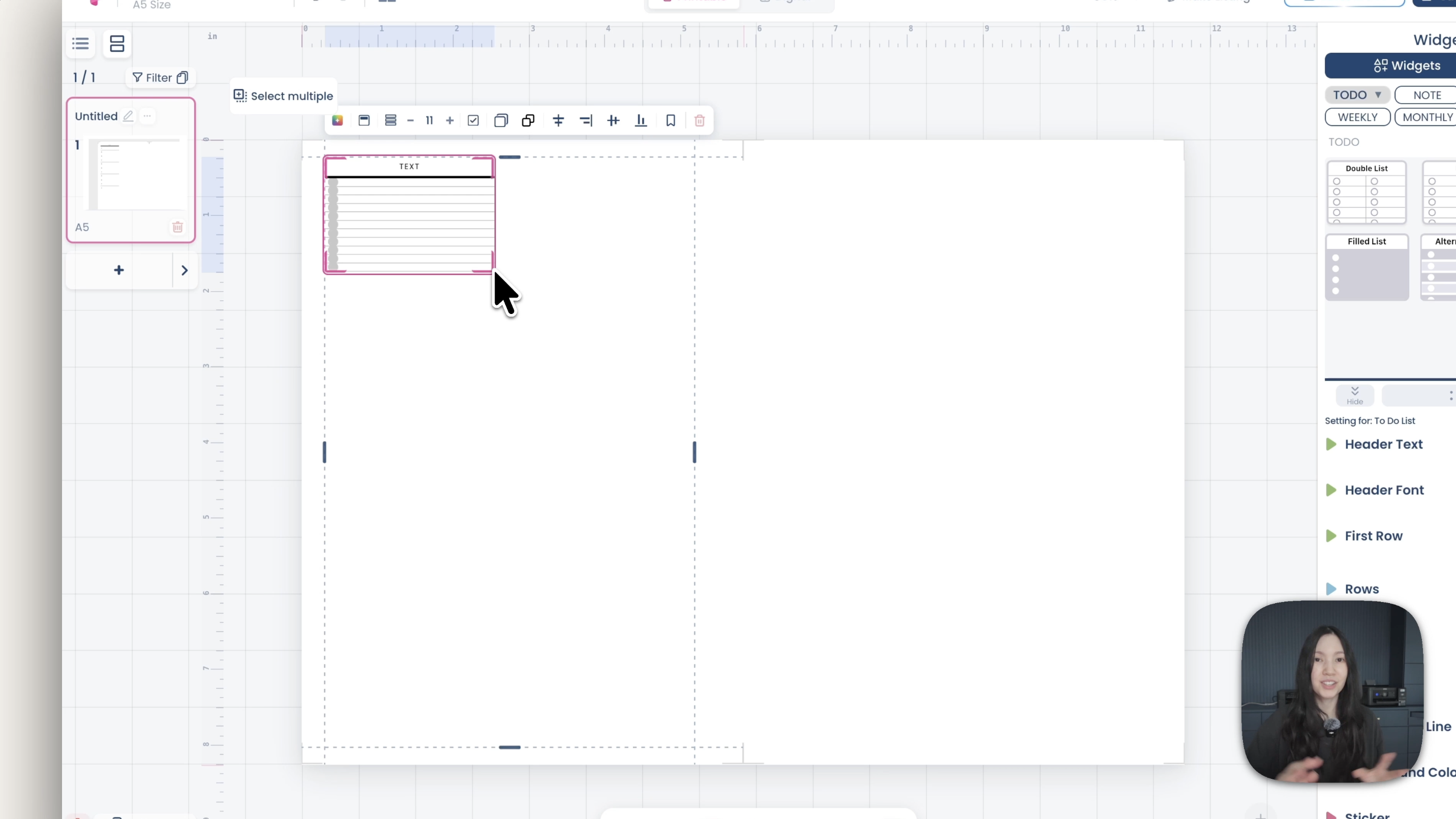
Now you can. Freeform is a new layout editor where you drag a widget straight onto the page, put it anywhere, and resize it to any size. No rows, no columns, no structure to build first.

Two editors, your choice
The old editor hasn't gone anywhere. Under Layout you'll now see two options at the top:
Rows and Columns — the original editor, working exactly as it always has.
Freeform — the new one, where widgets go wherever you put them.
Every existing planner still opens in Rows and Columns by default, so nothing you've already built has changed.
What you can do in Freeform
Go to Layout, select Freeform, then open Widget and drag anything onto the page — a to-do list, a grid, a tracker. Drop it where you want it and drag the corners to resize.
From there it behaves the way you'd expect from a design tool:
Hold Option (Alt on Windows) and drag to duplicate a widget.
Select several widgets and resize them together.
Use the handles beside each widget to resize it individually.
Arrow keys nudge a widget one grid square at a time.

Aligning and spacing
Three alignment tools cover most of what you'd otherwise do by eye.
Space evenly across — select several widgets and it distributes them evenly across the available space.
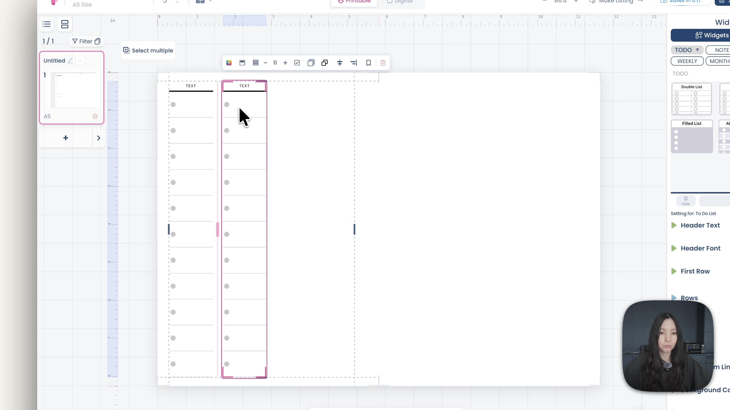
Space between widgets — asks you for a gap width and applies it consistently between each one.
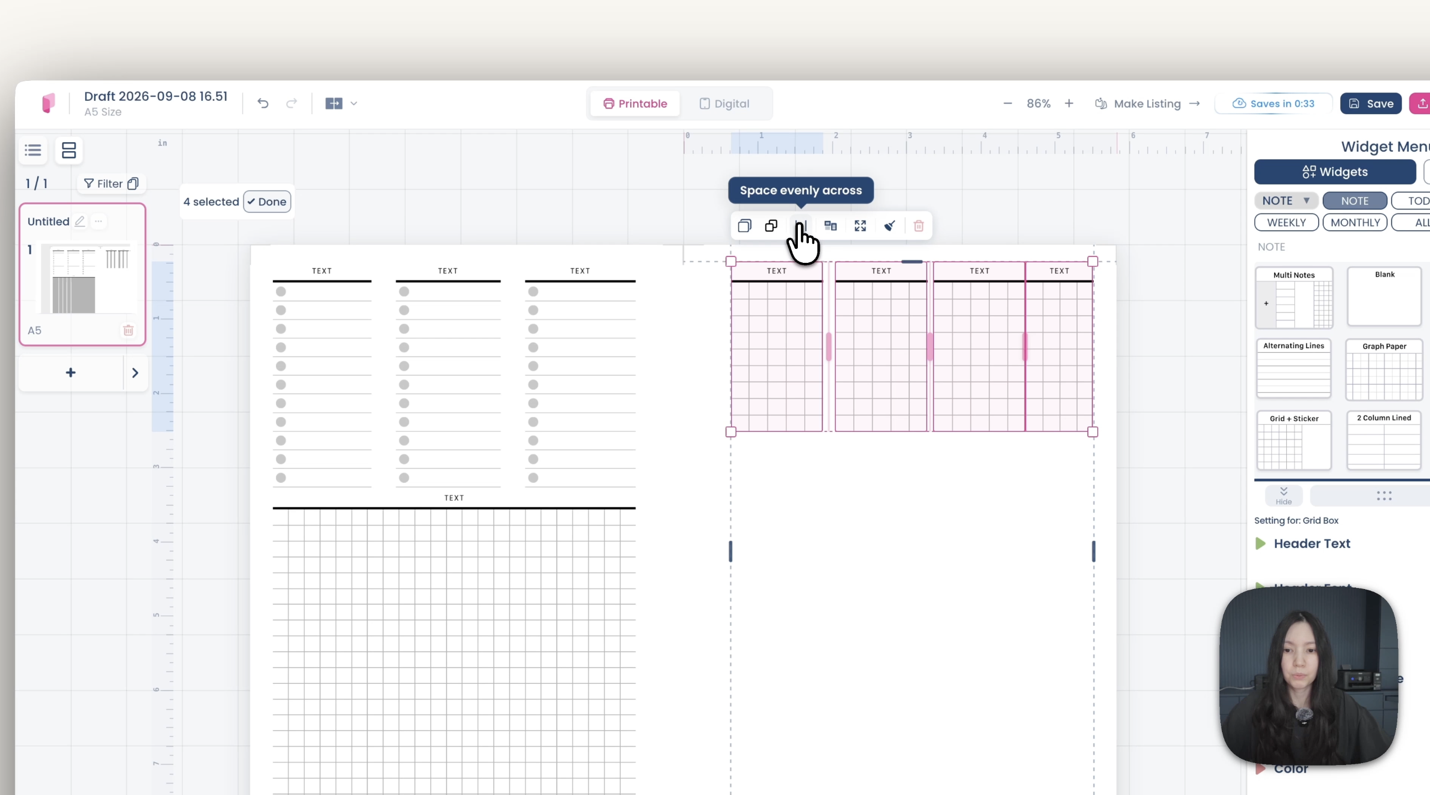
Equal width, fill the row — stretches the selected widgets so they share the row equally.

Select four grid widgets, click equal width, and they line up properly in one go.
The grid and automatic spacing
Under Layout you can show the grid, which makes placement much easier to judge — and arrow keys move widgets by exactly one square.

There's also a spacing setting. Turn it on, set it to three, and Planify Pro keeps a three-square gap between widgets automatically as you drag them around. Set it to six and it keeps six. You can still adjust things by hand; the gap is maintained as you go.

The handles beside each widget can be turned off if you find them distracting, though we'd suggest leaving them on — they're how you resize individual widgets.
Switching between the two
You can switch a planner back to Rows and Columns at any time, and it will pick up where the old editor left off.
One thing worth knowing: we'd recommend choosing one editor per project and staying in it. Switching back and forth is possible, but each editor handles layout differently, and a design that has moved between them a few times can end up needing tidying. Pick the one that suits how you work and build the whole planner there.
Using Freeform with templates
Templates open in Rows and Columns by default. Apply one, switch to Freeform, and it converts the template so you can carry on editing it freely.
Expect small differences after the conversion — the layout is being reinterpreted, so a few things may sit slightly differently. From that point on you can edit everything the Freeform way.
Which one should you use?
If you've been finding the layout editor frustrating, start with Freeform. It's the closer match to how most design tools work, and there's much less to learn before you can put something on a page.
If you're already comfortable with rows and columns — particularly for structured, repeating layouts like dated dailies where consistent alignment matters — there's no reason to change.
Both editors are available on every plan.
Questions?
Message us on Instagram or in the Facebook group and we'll help.
New to Planify Pro? Start with how to make a custom planner, or browse the DIY tutorials.