
Your listing photos decide whether anyone clicks. On Etsy, a buyer scrolling search results sees a thumbnail and a price — nothing else. The photo does all the work of getting them to stop.
That's a particular problem for planner sellers, because a digital product has nothing to photograph. There's no object on a desk. What you're selling is a PDF, and a screenshot of a PDF looks like exactly that.
This guide covers what makes a planner listing photo convert, Etsy's requirements, and the fastest way to produce a full set.
What Etsy actually requires
Before design, get the technical side right or your listing is handicapped from the start.
- Minimum 2000px on the shortest side. Etsy allows smaller, but zoom looks poor below this.
- Square, or 4:5 portrait. Square is safest — it's what the search grid crops to.
- Ten images per listing. Use all ten. Listings that fill every slot consistently outperform those with three.
- The first image is everything. It's the only one most buyers see. Treat the other nine as the shop window once they're already interested.
Digital products also need to be clearly marked as digital. Read our guide to Etsy's listing policy for what's changed.
What makes a planner listing photo convert
Show it in use, not in isolation
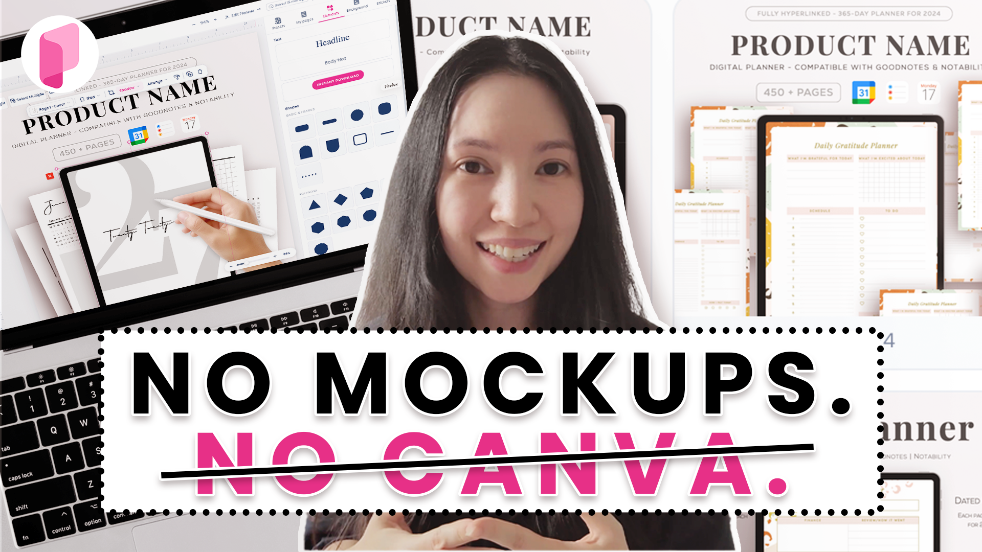
A flat PNG of a weekly spread tells a buyer nothing about scale, feel, or context. The same page shown on an iPad, with a hand and a stylus, immediately reads as a product someone uses.
This is the single biggest difference between listings that sell and listings that don't.
Make the first image legible at thumbnail size
Open your listing on a phone. If you can't tell what the product is at that size, it fails. That usually means fewer pages shown, larger, with more contrast.
A common mistake is cramming twelve pages into the first image to show value. At thumbnail size that's a grey smudge.
Say what they get
Buyers of digital planners want to know page count, whether it's dated, and which apps it works in. Putting "180 pages · Dated 2027 · GoodNotes & Notability" as text on the second image answers the three questions that otherwise become messages you have to reply to.
Keep one visual style across the shop
When a buyer lands on your shop page, twenty listings in the same palette and layout look like a brand. Twenty different styles look like a marketplace. Consistency is what makes a small shop look established.
Use the last slots for detail
Once you've earned the click, the remaining images can do the selling: a close-up of the hyperlinked tabs, the full page index, a sticker sheet, an instruction card. This is where a browsing buyer becomes a confident one.
The slow way and the fast way
The manual route is a mockup file in Photoshop or Canva: place your screenshot into a smart object, adjust the shadow, export, repeat for every image and every listing. For a shop with thirty products and ten images each, that's three hundred exports.
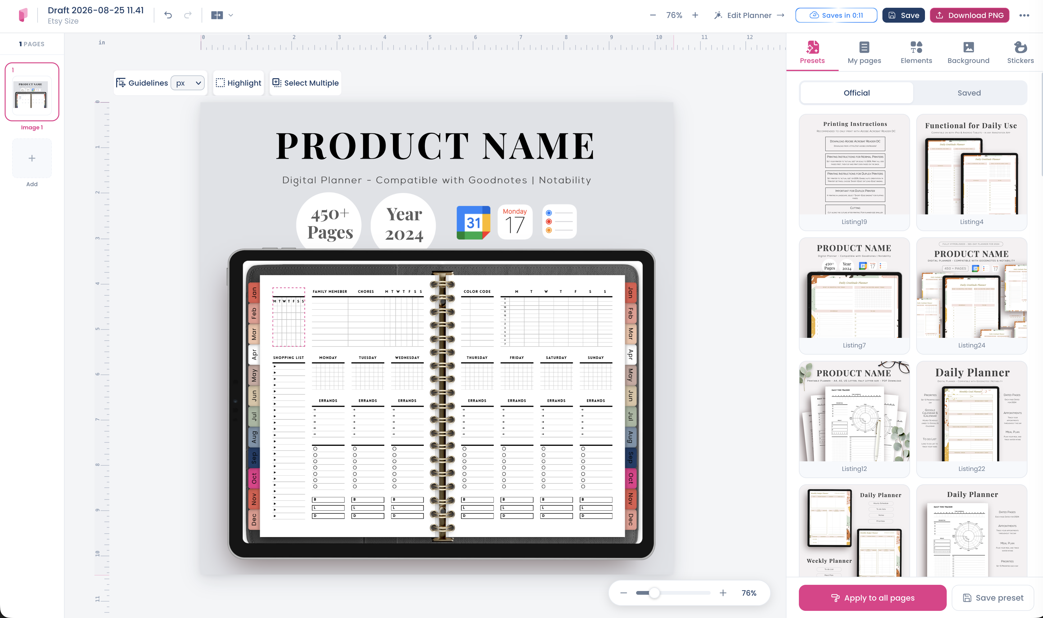
Planify Pro has a listing image maker built into the editor, which removes the export loop entirely. You pick pages directly from your planner project, drop them into device mockups, and download finished listing images — no screenshotting, no separate design file, and the page updates automatically if you change the planner.
You can select which pages to display, add iPads, hands and stylus elements, adjust shadows, and set backgrounds to match your shop's palette.
Try the listing image maker — it's included with every plan.
A workflow that scales
Once you're producing listings regularly, this order is fastest:
- Build one template per product type — one for dated planners, one for notepads, one for sticker sheets.
- Swap the pages, keep everything else. Background, mockup placement and text stay fixed, so every listing matches.
- Produce all ten at once rather than returning to a listing later.
- Save your palette so new products inherit the same look without rebuilding.
The first template takes a while. Every listing after it takes minutes.
Common mistakes
- White background, no context — reads as a stock file, not a product
- Text too small to read on a phone — most Etsy traffic is mobile
- Using fewer than ten images — free real estate left on the table
- Different style per listing — makes an established shop look scrappy
- No page count or app compatibility — creates avoidable pre-purchase questions
Keep going
- How to sell planners on Etsy — the full guide
- Etsy's listing policy — what digital sellers need to know
- 9 mistakes to avoid
- What you need to start a planner shop
- Pinterest marketing for planner shops
You can also follow along on Instagram, YouTube and Pinterest.